Color Focus: Incorporating Pantone Colors into Home Design
Color has the power to shape a mood, warm a room, and define a space — and in luxury design, it’s one of the most nuanced tools in the palette. At TrueLux Fine Homes, we believe in blending on-trend tones with enduring elements to create interiors that are both current and timeless.
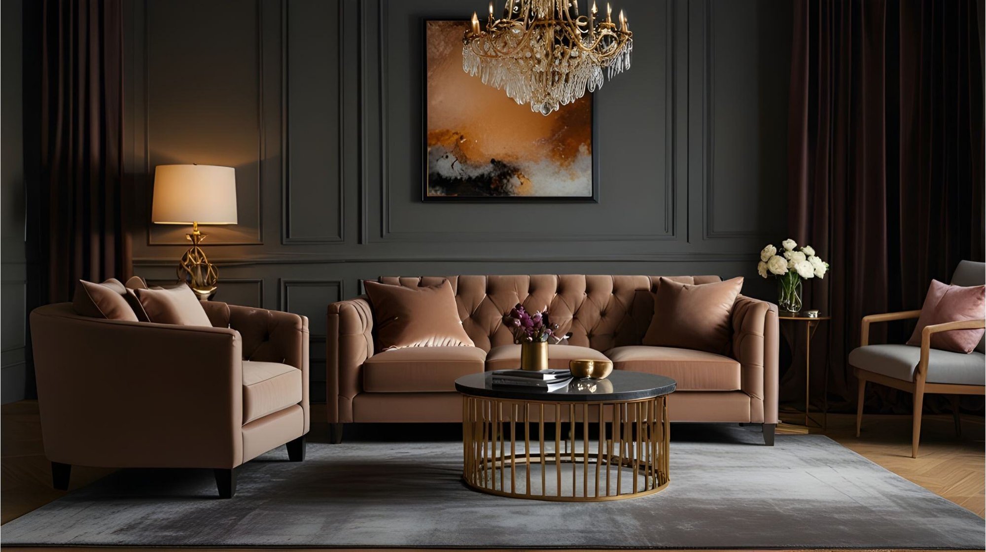
This year, Pantone’s Color of the Year — Mocha Mousse 17-1230 — takes center stage. A warm, grounded brown, it offers a sense of comfort and richness that works beautifully across a range of architectural styles. Whether used in a statement piece or a subtle accent, it brings depth and warmth without overpowering a space.
Here’s how to thoughtfully incorporate Mocha Mousse — and other seasonal hues — into your luxury home design in ways that feel refined, lasting, and entirely your own.
Weaving Trendy Hues into Timeless Interiors
Incorporating seasonal colors into a custom home doesn’t mean chasing fleeting trends — it means curating the right accents that complement your home’s architecture and core palette.
Mocha Mousse is an ideal example: earthy, sophisticated, and versatile enough to be used in both traditional and modern settings. Rather than painting entire rooms or making bold commitments, we recommend layering in color through
- Plaster-finished feature walls or millwork in tonal browns
- Textiles and upholstery in warm neutrals with rich undertones
- Custom drapery, pillows, or accent furniture that feel intentionally seasonal
- Art curation that highlights earthy palettes and natural themes
TrueLux Tip: Treat color as a supporting character — not the lead — by weaving it into tactile surfaces and design accents rather than focal architectural features
Pairing Seasonal Colors with Classic Materials
Luxury homes are built to last — and so are the materials we choose. The key to making seasonal colors feel elevated is pairing them with timeless textures that have history and integrity.
|
Seasonal Hue |
Ideal Pairing Materials |
|
Mocha Mousse |
Calacatta Gold marble, white oak, antique bronze |
|
Warm Sage |
Rift-cut walnut, unlacquered brass, brushed travertine |
|
Terracotta Clay |
Limestone, aged leather, oxidized copper |
TrueLux Execution: During a custom build or remodel, our team walks you through cohesive pairings in our finish library — blending materials like white oak flooring, soft plaster, and aged bronze to create a canvas where seasonal hues shine effortlessly.
Paint & Fabric Selections for a Refined Look
Paint and textiles offer a practical, luxurious way to introduce seasonal tones like Mocha Mousse without committing to structural change. When working with clients, we often curate from designer-forward collections that bring richness and refinement.
Paint Pairings
- Mocha Mousse-Inspired:
These rich, layered browns have complex undertones that shift beautifully throughout the day.
Fabric & Textile Ideas
- Fabricut: Look for warm-toned velvets, textured bouclés, or embroidered linens in earth tones
- Kravet: Muted wool blends and suede-like textures in camel, cognac, and coffee
- Schumacher: Bold yet balanced patterns for pillows or drapery in terracotta and warm taupes
These are the details that soften a space and bring seasonal color to life — with clarity, not clutter.
FAQ
Is Mocha Mousse suitable for modern homes?
Yes — its warmth brings balance to sleek, minimalist spaces. We often pair it with pale woods, limestone, and matte black fixtures for a sophisticated contrast.
How can I use Mocha Mousse without darkening the room?
Use it as an accent: think mohair throw pillows, a curated rug, or custom built-ins with soft lighting. It adds richness without heaviness.
What if I want my home to feel light and airy?
Seasonal colors like Mocha Mousse don’t have to dominate. Our design approach ensures balance — layering these tones against crisp whites, brushed finishes, and open layouts.
Can I combine multiple seasonal hues at once?
Absolutely. When grounded with classic materials, mixing tonal greens, clays, and browns can bring life and variety to a room — without chaos.
Ready to bring seasonal sophistication into your space?
Let TrueLux Fine Homes guide the way. Our design-build process ensures that every color, finish, and fixture is tailored to your home’s style — with warmth, clarity, and craftsmanship built in.
At-a-Glance: Seasonal Color Integration
|
Design Element |
TrueLux Recommendation |
|
Paint |
Use in formal dining rooms, offices, or powder rooms for depth |
|
Materials |
Pair with natural stone, wood, and aged metals |
|
Upholstery/Fabrics |
Layer texture & tone with quality textiles from Fabricut, Kravet, and more |
|
Rooms to Feature Color |
Entryways, libraries, accent walls, curated vignettes |
|
Designer Insight |
Choose colors with layered undertones that age gracefully |